Cruise Days 0 and 1

We arrived on time in Miami after a layover in Newark and caught a cab to our hotel, the Hilton Miami Downtown. We were treated to an upgraded suite and discovered we had both a living area, with seating for 6 plus a dining room for 6 as well as a separate room with king size bed. We relaxed in the room for a bit then stopped by the Publix to buy two bottles of wine to bring with us on the ship (you are allowed two bottles per stateroom). We were happy to find Kim Crawford Sauvignon Blanc in the store and picked up two bottles to enjoy over the next two weeks.

A fun coincidence, our wine list was printed on our wedding day!

After we returned we got cleaned up and headed to our dinner reservation at Michy’s, Michelle Bernsteins restaurant in Miami. We had seen there was a tasting menu online and that’s what we ordered when we arrived. We were offered three or four course options, with an optional wine pairing. Figuring that we were on vacation we decided to treat ourselves and get the four course with wine. We were surprised (and delighted) to discover each “course” consisted of three separate and distinct smaller dishes.

The next morning we found a fun greasy spoon diner called S&S for breakfast, then killed time in the room before checking out (and waiting 20 minutes for the down elevator). We got a cab from the hotel and were able to immediately get checked in to the cruise. The rooms were not available until 2pm so we relaxed on one of the upper decks, grabbed a light lunch, and then headed into our room to unpack and then do our “muster” drill. Afterwards we explored around the ship a bit, then got ready for dinner at 6. We learned you don’t need to arrive early to dinner, as they don’t open the doors until exactly 6pm (much to many folks’ chagrin). Our table is right next to the door, a six top. Our tablemates are John (retired from Safeway) and Karen (a hygienist) from the Bay Area of California, who have been dating for two years after meeting on match.com. Our other tablemates are Ethel and her husband who are from New Mexico. We all chatted and seemed to get along well, John and Karen are quite into cooking and wine so we found quite a bit to talk about. After dinner we headed in to watch the theatre show, and after the show discovered we are only one of four newlywed couples on the ship (with one of the other couples appearing nearby us throughout the day, in line to check in, waiting for dinner, then sitting near us in the theatre). There is a newlywed/anniversary reception on the ship that I think we will go to to try and connect with some of the younger folks here on the cruise.

We’ve ordered room service breakfast tomorrow, so looking forward to that. They are offering some dance lessons tomorrow, we may also explore the fitness facilities, and I have a feeling Jeremy will be doing a lot of reading 😉

More

How to tip the odds in your favor in search results – Headings, images & content (part 3 of 3)

(cross-posted from the W&M Creative Services Blog)

So you’ve set up the framework for your page, placing it in the appropriate spot on your site, giving it a readable URL and meaningful title, and filling in the description metatag. Next we will take a look at what goes into the main content area on your page.

Useful Headings

Headings help to create a hierarchy of information on your page. One way to think of headings is as if you were writing an outline of your page’s content like you did back in middle school for a research paper. If you skim the headings do you get the gist of what the page is about? W&M’s Web Writing & Style Guide encourages you to use headings thoughtfully and sparingly, which is also good practice for SEO. Use heading tags where it makes sense. If there are too many headings on a page your users will not know where to start visually; they will not be able to quickly determine what content is important, and they cannot easily scan to find what they were looking for on the page. Keep in mind, if your user cannot find what they’re looking for amongst a sea of headings, how will the search engine?

Images with “alt” text

Images may seem like just a nice visual element to add to your site but you can optimize them for search engines as well. All of your images should have “alt” text that is descriptive and can serve as a reasonable alternative (thus the “alt”) to the image if it cannot be displayed or is being “seen” by a screen reader for those users with vision impairments.

Another helpful SEO tip is to give your files meaningful names (just like your folder System Names). Rather than IMG0123.jpg, name it crim-dell-bridge.jpg (being sure not to use spaces, capitalization or any special characters aside from dash (-) and underscore ( _ ) ). Google looks at file names just as it looks at the URL and page name of your site, so giving it a meaningful name will help both the search engine and yourself find images.

Descriptive Links

Anchor text, the clickable text that users will see as a result of you adding a link to your content, should tell users (and Google) something about the page you are linking to. Avoid using “click here” or similar phrases. Instead describe where the link will take the user. This way it is easier for the user (and search engine) to scan the page and find relevant links as well as understand what the page you’re linking to is about.

Quality Content

Putting up clear, quality, relevant content on your website, whether in the form of an informative page title, well structured links, or useful image descriptions will help your page become more relevant to search engines. However, what influences your website more than any of these factors is the main content of your page. Creating compelling and useful content is what drives users to come to your page in the first place, and is what will prompt them to share that content and create the buzz that helps build the reputation and credibility of your site.

Content Questions to Ponder

If you are finding that your site does not appear where you expect it to when searching for a particular term, examine your content (this includes your page title, links and headings as well as the main content). Do you mention the search term you’re looking for anywhere in your content? Is it important enough that you should adjust your page title to include the term? You never want to “stuff” your page with search keywords to try and increase your rankings. However, if you find that people are searching for “agenda” when you are using the word “program” you may want to tweak your content to use that more common search term instead.

So with SEO it pretty much boils down to: write good content, name things clearly and concisely, and just generally be “friendly” to your users. These steps will take you a long way in making your site more relevant to Google and its searches, both on wm.edu and on Google’s main site. Happy searching.

More

How to tip the odds in your favor in search results – Titles, links & metatags (part 2 of 3)

(Cross-posted from the W&M Creative Services Blog)

We started with a quick overview of what Google says to concentrate on in your search rankings (do what’s best for your visitors) and how the W&M site search works. Now let’s move on to your actual web pages, starting with the things you create first when you make a new page.

Clear Site Hierarchy

Try to structure your website with the most important information “up front,” either linked from the homepage or very easily accessed from it. Using this kind of hierarchy in your site helps both users and search engines determine what is most important on your site.

Readable URLs

The system or file name is pretty much always the first thing you set when creating new content and it is what forms the URL for your page. For your system name try to be as descriptive as you can. Use dashes (-)  to separate words if you want a multi-word system name, for instance “meeting-minutes” rather than “meetingminutes.” Using a character like the dash or underscore to separate the words makes the URL easier for Google (and your users) to see what your page is about, a page like “www.wm.edu/folder1/folder2/index.php” is much harder to remember and figure out what the content is about than “www.wm.edu/about/history/index.php.” If there are key words in your page URL those will also be indexed in Google’s results, so this is one more spot where using meaningful names for your pages can help improve your search rankings.

Concise and Effective Page Titles

Each page in your site should have a short but unique title that clearly indicates to both Google, and the person viewing your site (either in search results or actually on the page) what the page is about and how it differs from other pages on your site.

Metatags (where needed)

Years ago the keywords metatag was a factor in search engine results but in recent years Google has begun ignoring the keywords field, mainly because sites were “stuffing” the keywords field to bump up their search results rather than putting in the most relevant keywords for their site. So this is not something you’ll need to worry about for your page.

A page’s description metatag gives Google and other search engines a summary of what the page is about. Although these do not directly influence the search results any longer, they are still important as search engines may use them as descriptive snippets for your page if it turns up in their results. Something to note, if the search engine finds text it deems more relevant to the user’s search, such as a sentence containing their search term, then that may be used as the summary for the search result instead of what’s in your description metatag.

As with page titles, the description for each page should be unique and specific to each page. If you copied the same description from page to page, how will users be able to distinguish which of your pages they want to visit when they come up in a search result? If all of the results from your site appear the same the user may skip your site altogether since it is unclear.

In the next post we’ll look at how the main content of your page affects your search rankings, with tips on how to improve those rankings using your images, headings and general content.

More

How to tip the odds in your favor in search results (part 1 of 3)

(Cross-posted from the W&M Creative Services Blog)

There is no magic bullet for getting your site ranked highly in Google’s (or any other search engine’s) search results. However, there are a handful of best practices that can help you make your pages more relevant to users and thus more likely to become top-ranked results in Google, this is referred to as SEO (Search Engine Optimization).

First, a starting thought from Google’s SEO Starter Guide (emphasis mine):

You should base your optimization decisions first and foremost on what’s best for the visitors of your site. They’re the main consumers of your content and are using search engines to find your work…Search engine optimization is about putting your site’s best foot forward when it comes to visibility in search engines, but your ultimate consumers are your users, not search engines.

Search results on wm.edu

On the W&M website we use a Google Custom Search Engine which, when you boil it down, is just Google’s normal search engine except it’s results are restricted to only look on a particular set of sites (in W&M’s case, anything ending in “wm.edu”). So all of the following tips from Google’s SEO Starter Guide will apply just as well to a site’s search results as to Google’s (although they may not match exactly).

In the next two posts we will work from the top down on a web page, from page URLs to image descriptions, exploring how each element affects search results — stay tuned…

More

Should you use QR codes?

The answer is…it depends. Sorry if you were hoping for a more definitive answer but, like many technologies, it really depends on how you are planning on using it and why.

Mashable named QR codes one of the 8 Big Trends That Shaped the Mobile Phone Industry in 2011, and being in on the latest trends is always tempting. I am all for exploring the latest technology, but I think a key step to take before using them (or any new technology) in your organization is familiarizing yourself with the technology beforehand. Sign up for that new social media site and use it personally for a while, or in the case of QR codes, how many times have you scanned a QR code with your phone? Or known others who have? When have you found it helpful?

Scott Stratten‘s UnMarketing Keynote at the National Arts Marketing Project conference offers some (rather humorous) examples of how not to use QR codes:

If you get past the step of concluding a QR code would be a useful addition to something your organization is doing, there are a few things to keep in mind:

Is the web site linked in the QR code optimized for mobile devices?

People are using their mobile phones for viewing whatever the QR code sends them to. You need to make sure the destination website is at least a mobile-friendly site (so the page is navigable on a small screen with no Flash, giant images, heavy Javascript or other visual effects), if not totally mobile-optimized.

Since your users are on mobile devices with smaller screens and slower download and processing speeds you must consider the structure of your content. Does the page require filling in a lot of information? Or downloading a large document? Or viewing a large amount of text or photos? If so, that’s probably not the best suited to viewing on a mobile site or interacting with on a, typically slower, mobile network.

Is the content useful in a mobile setting?

Another thing to think about is whether the information you’re linking to is something that a person who is on a mobile phone would find useful and interesting. The link could utilize the fact they are on a mobile phone to add your organizations event to their personal calendar, or a contact to their address book. Or you could offer additional photos or videos related to something you’re advertising; “exclusive” content that’s just for folks who scanned the QR code. However, if you’re simply directing them to a page on a website that they could just as easily see on their computer, that’s not really rewarding the scanner for their time and effort (however minimal) to scan the QR code.

Is there a reward/motivation for scanning the code?

Something to keep in mind for higher education institutions in particular, a recent survey reported that most (75%) of college students won’t scan QR codes, so whatever the content is, it needs to be something that motivates the students enough to be willing to download a QR code reader (if they don’t already have one) to find out the information.

Learn More

Intrigued? Hubspot offers a quick 4 step setup guide that can get you started. Plus, here are a few more good tidbits about QR code use:

“QR codes function as context portals, enhancing our in-person experience with related digital information — for example, a flyer for a career workshop with a code driving you to a basic (mobile-friendly!) registration form or an advertisement for a concert featuring a code linking to a short video preview. There’s a lot of debate about the future of QR codes, but whether they stay or or go these types of informational way stations will be critical connectors in this new landscape, delivering contextually-relevant content.”
-Georgy Cohen, Aligning Content Online and Offline, Meet Content

“QR codes do enjoy a high-level of awareness among college students yet only a fraction (21%) could properly scan and activate the code. Why the discrepancy? According to our findings, students simply struggled with the process. Some didn’t know a 3rd party app was needed, many mistakenly assumed it could be activated with their camera, and others just lost interest, saying the activity took too long.”
-Don Agguire, QR Codes Go to College, Archrival Youth Marketing

“Employ simple language around the code itself.  Not necessarily every user knows what a QR code is or that you must download the app prior to using.  An example ‘Scan this code with your smartphone to watch these stories’ and be as specific as you can as to what the viewer will see.”
-Nicole O’Connell, To Scan or Not to Scan: Use of QR codes in Enrollment Marketing

Another interesting read is Mashable’s Why QR Codes Won’t Last which drummed up a lot of discussion in the comments.

Have you successfully (or unsuccessfully) used a QR code in a campaign? What was your experience?

More

First notes on Facebook Timeline for Pages

So as the internet chatter predicted, Facebook rolled out Timeline for Pages today. The page administrators have 30 days to fill in and polish up their timelines and then Facebook will roll over all pages to the new layout at the end of 30 days.

A few things to note:

  • The timeline won’t go live until you hit “Publish” or at the end of March, so fill in as much as you can before then, pinning important posts to the top of your page, starring important events in your timeline, etc.
  • The timeline cover photo is the same dimensions as the personal page one, 849 pixels wide by 313 pixels tall. A photo is not selected by default for you so you’ll have to choose something from your existing photos (it must be at least 720 pixels wide) or upload a new image.
  • In addition to the cover photo you’ll need to have a profile icon which should be square and at least 180 pixels wide.
  • Photos, likes and apps are now at the top of your Page along with your “About” blurb. Photos show in the first spot, then likes, then you can order the apps after that (you get a dropdown menu that will reveal all the apps once there’s more than 2).
  • You can no longer have an app as the default tab for your page. This is a big change and means that the “Welcome” and “Like Us!” tabs that so many pages have created will now be relegated to being just another tab the user has to find and click on. I will be very interested to see how pages adjust to this new paradigm.
  • Fans can now contact you privately with messages that will show up in the newly designed admin panel along with insights, new likes and activity.
  • The “Use Facebook as <page>” option is now buried under the Admin Panel in the Manage dropdown at the top of the page (the “Edit Page” option is also in this menu).

I’m sure more “features” will be discovered as more folks transition to the new layout. If you find something of interest, please let everyone know about it in the comments.

More

EDUniverse…go explore!

I wanted to spread the word about a new site that launched on Friday called EDUniverse. It’s a great centralized place to keep up to speed on blog posts and presentations from higher education folks all over the web. The site is a great resource for finding new, relevant and interesting higher ed related content, discovering higher ed folks on Twitter, and just keeping up with what’s going on in the industry. I was asked by mStoner to be an early contributor to the site and am so excited to see it live (and had a great time at the launch event in Boston this weekend, so great to meet and chat with so many amazing higher ed folks in person). I’d encourage you to sign up for an account and start exploring.

More

Better Facebook statuses with links

Having links, photos or videos in your Facebook status updates is shown to increase engagement by your fans. When there is more than just a plain text status update you are more likely to capture your audience’s attention and stand out in their news feed if you have an interesting visual element.

Facebook auto-generates a thumbnail or small image preview when you include photos or videos in your status updates. If you are linking to a webpage in your update (which you can do by simply pasting the URL into your status), Facebook will create a preview of that link to include with the status by looking on that page for a suitable title, description and image to use as the thumbnail. The title and description of the preview typically come from the page title and the first bit of content on the page. The image is pulled from anywhere on the page that Facebook thinks is a suitable image. If there are no images found on the page you are left with just text, which is not as intriguing for your fans.

You can assure that there’s always an image to include by using one of two methods: adding an “image_src” link tag to the head of your HTML document, or by including an appropriate image on the page (this can either be included to supplement the content of the page or hidden from view with a bit of CSS styling).

The syntax for adding the image_src link is:

<link rel="image_src" href="http://site.com/image.jpg" />

By including this code in your HTML header you are telling Facebook to use this, and only this, image for your page. This is useful if you want to enforce consistency when folks link to your site by having the same logo or photo associated with your links. However, the side effect here is this will restrict a user from selecting any other image on your page (if there are any available) as the thumbnail for the link.

The second option is to have an image in the body of your page somewhere, either in the content or hidden from view on the page. This allows you to have both a “default” image to use if there isn’t one available on the page, and to allow selecting a more appropriate image from the content if it is available.

If you do not want to show the image you can hide it with:

style="display: none;"

added to your HTML image tag, this will hide the image from view in the browser, but allows Facebook to still see the image and include it for use as a link thumbnail.

Bonus Tip: You can trick Facebook into having two links in one status update by pasting the URL of the first link into your status update, adding a space at the end so Facebook recognizes it as a link and adds the preview, then you can delete that URL, compose the rest of your status update, and paste in a second supplementary URL.

More

Comfort Apple Pie

For the past few months Jeremy and I have gotten together with three other couples to have “wine dinners.” Each couple brings a course (appetizer, first course, main course or dessert) and a bottle (or two, or three) of a wine they think pairs well with their dish. So far we have had three dinners with Italian, Spanish, and most recently “comfort food” themes. Jeremy and I were in charge of dessert this go-round and figured, what is a more classic comfort food dessert than apple pie? I began venturing into from-scratch pie making this holiday season, starting with an apple pie for Thanksgiving and followed by a strawberry-rhubarb pie for Christmas Day dinner, so this was my third pie-making attempt, second apple.

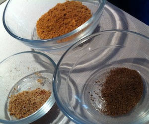
Spice trio

Photo by Jeremy Beker (I was mixing pie crust at this point)

Jeremy and I both looked around online and through our library of cookbooks in search of the “best” apple pie recipe. In the end the Allrecipes.com iPad app provided the winning base recipe, Apple Pie by Grandma Ople. The recipe has over 4,400 reviews and had a five out of five star rating, so I figured with that kind of crowd-sourced recommendation, it was probably a good place to start. We knew we wanted to use spices in the pie filling (the original recipe does not call for spices oddly enough) so that was the first “tweak.” We had some real cinnamon that we brought back from the Caribbean two years ago so that was the star spice in our blend, along with nutmeg and allspice. If you have never had “real” cinnamon, you are in for a treat. Most “cinnamon” you buy in the grocery store is actually from the cassia plant, and has a much sharper and spicier flavor whereas cinnamon is a much warmer, rounder and richer flavor. (To learn more about cinnamon and cassia, and to buy either one, Spice House is a great resource.)

Our second tweak stemmed from the step in Grandma Ople’s recipe that called for creating a syrup out of water, butter and sugar to use to pour over the apples once you had mounded them into the pie. From our earlier recipe readings, and using a bit of science from Alton Brown’s Super Apple Pie recipe, I decided to first put 2/3 of the sugar in with the apples and let them drain over a bowl for about an hour and a half, then used that juice in place of the water for the syrup, reducing it down to really intensify the apple flavor. This way there is not as much liquid in the pie to make the crust soggy and you capture and concentrate the apple flavor. We also opted to pour the syrup in with the sliced apples and mix it together rather than just pouring it over the apples once they were in the pie pan.

Uncovered pie

Apples expertly mounded by Jeremy (who also took the photo)

The third tweak was to use a trio of apples rather than just one variety. Jeremy found an article on Serious Eats testing the best apples for apple pie so using their recommendations for the two best “pie apples” (selected for their flavor) Braeburn and Golden Delicious, along with the “traditional” Granny Smith (for structure and acidity) we had our star ingredients selected.

I had very good luck with the pie crust I made for my Christmas strawberry-rhubarb pie so I reused that recipe, the combination of butter and shortening is the key, you get the flavor and flakiness from the butter plus a tender crust from the shortening.

So without further ado:

Comfort Apple Pie

The finished product

Comfort Apple Pie
 
Prep time
Cook time
Total time
 
Three-apple pie with warm spices and a flaky sugary crust.
Author:
Recipe type: Dessert
Serves: 10
Ingredients
  • 2 Braeburn apples, peeled, cored and sliced into ¼" slices
  • 2 Golden Delicious apples, peeled, cored and sliced into ¼" slices
  • 3 Granny Smith apples, peeled, cored and sliced into ¼" slices
  • ½ cup unsalted butter
  • 3 tablespoons all-purpose flour
  • ½ cup white sugar
  • ½ cup packed brown sugar
  • 1 tablespoon cinnamon (fresh ground if possible)
  • 1 teaspoon allspice (fresh ground if possible)
  • 1 teaspoon nutmeg (fresh ground if possible)
Instructions
  1. Preheat oven to 350 degrees F and place your oven rack in its lowest position.
  2. Combine the brown and white sugar, reserving ⅓ cup.
  3. Mix the sugars in with the apples, place in a colander over a large bowl to collect juices, let sit for at least 1 hour.
  4. Make the pie crust and refrigerate for 1 hour.
  5. Once apples and pie crust are ready, melt the butter in a saucepan. Stir in flour to form a paste. Add apple juices and remaining sugar mixture and bring to a boil. Reduce temperature and let simmer for a few minutes and then remove from heat.
  6. Roll out your bottom and top pie crusts.
  7. Place the bottom crust in your pan and brush with egg-whites.
  8. Add the spices into the melted sugar mixture and mix in with the apples.
  9. Layer the apples in the pie pan so there is little space between the slices, continue with as many apple slices as you can fit, mounding in the center.
  10. Cover with top crust, seal edges, cut slits to vent, brush with egg-whites and dust with sugar.
  11. Bake 15 minutes in the preheated oven on the lowest rack of the oven.
  12. Move pie up to the middle rack of the oven and continue cooking until the apples are softened, approximately 45 minutes.
Notes
Feel free to tweak the spices to your taste. By keeping the apple layers as compact as possible you can prevent the apples from "sinking" as much when they cook leaving you with a half empty pie shell. The egg wash on the bottom crust will help keep the crust from getting soggy. The egg wash on the top crust helps with browning and acts as an adhesive for the sugar. To keep the crust from overcooking, make a "collar" to go around the pie out of tin foil. Starting at the lowest rack of the oven helps with cooking the bottom crust and making sure it doesn't get too soggy. Wine Pairing Recommendations: We had this with the Wagner 2008 Riesling ice wine but muscat, riesling, sauternes or late harvest wines would also work nicely (according to What to Drink with What You Eat).
More