Cross-posted from the W&M Creative Services Blog
Back in April we mentioned that we were working on a new responsive design for the main W&M website (www.wm.edu), and after a few browser fights (thanks Internet Explorer), a dozen test devices and many hours coding and tweaking, we launched our new design on July 23, 2013. (Grad school sites will follow suit in the coming months.) Now every office, every academic department and every other page on the W&M site adjusts its layout to best accommodate how you are viewing the site, regardless of what device you’re using (desktop, laptop, tablet or mobile).
The announcement
To announce the launch our office made a little stop-motion video (our first!) starring the computers, phones and tablets of various Creative Services staff members:
The motivation

Desktop/laptop view of the W&M website. The green bar on the left is the page navigation, center light tan area is the main content, and the darker tan boxes down the right side are the supplementary content.
The idea behind this change was spurred in large part by the fact that our mobile and tablet visits have gone from less than 2% of our site traffic in 2009 to over 17% of our traffic this summer. With so many mobile and tablet visitors (and more sure to come) we wanted to ensure everyone could easily navigate and view all of the content on our website, not just our homepage (which we made responsive last year).
Prioritizing
So what was involved in this redesign? Up first was evaluating which parts of any given page are the most important, and it is, unsurprisingly, the main content. That main content is why you search Google, click a link in a social media post, or work your way through navigation menus. This needs to be front and center (and top) regardless of how you are looking at the website. So, after our global site navigation and header, the most prominent thing you will see is always the main content. We then ordered the rest of the content: page navigation, supplementary content, etc.
The major changes

Tablet view. Here the right column has been moved below the main content area and the top “global” site navigation has been adjusted from one row to three.
As you begin decreasing the width of your browser window we adjust the global navigation to become three columns rather than one row (since the single row will no longer fit).
We then move the right column, which contains “widgets” with photos, Twitter feeds, related links and other supplementary content, down below the main content area.
So, with this first batch of changes nothing is removed, only rearranged to best showcase the content (this is a key feature of responsive design). Once the page width is even narrower, the menu on the left side of the page drops down below the main content as well (keeping its familiar green background for continuity). However, keeping in mind that page navigation is a useful and important part of the page, we provide a “Site Menu” link so you can quickly get to that area when you need to. In between all of these steps the content is stretched to fit the width of the page, and photos and tables are resized to be as visible as possible.
Those with a careful eye may also notice a few style tweaks, all made to enhance the user experience. We removed busy lines from the menus, adjusted the color and size of the content headings, and increased the font size and line height of the content. All of these updates were made to give the site a bit more space to “breathe” and to make things easier to read. We also ensured that our treatment of text links is consistent throughout the site, helping with the overall usability of the site—if a word is bright green (underlined or not) it is always a link.
Cheap as free “mobile version” for all, no app needed

Mobile view. A link to the site menu replaces the menu itself and the main content comes up front and center, with supplementary content following.
One of the best parts about a responsive design is that it is a seamless improvement for the folks creating the web content. Nothing changed in Cascade (our web content management system) from the web editor’s perspective. They still enter their page title, content, photos, links and so forth, just as they always have, except now the content they entered is mobile (and tablet and desktop) “friendly.”
What’s next
Currently our team is focusing on updating our four graduate school sites with their own responsive designs. Along the way we’ll also be making a variety of supporting sites responsive (those W&M sites not hosted in Cascade, like the directory, W&M Experts and W&M Events).
What do you think of our new design?

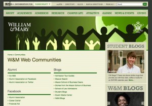
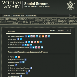
 This project started over two years ago, combining a “Web Communities” page that was maintained in our content management system and a Twitter-only stream of updates from the (then) two dozen or so College-affiliated accounts. Realizing that updates for more than just Twitter could be shown using the various RSS feeds and web API’s available, the stream of updates was expanded to include Facebook, YouTube and Flickr. The list of Twitter accounts that had been used in the previous site, along with the Facebook pages, YouTube channels, blogs and Flickr accounts that we knew of from the Web Communities page were combined and divided into two lists so things would be a bit easier to find and particular audiences could have an easier time finding what they needed.
 This directory worked well for a while, but as more and more organizations on campus joined in on social media and the variety of social media options continued to expand (Instagram, Pinterest, Tumblr, LinkedIn) the two column list began getting a bit unruly. So at the end of 2012 the social media team decided to revamp the directory portion of the site by moving the data into its own database (using
 So you want to have video playback in your Android app? This is pretty straightforward to do once you know what you’re looking for and, aside from a few (rather tedious to figure out) small snags which I’ll go into later, can be completed relatively quickly.