Category: W&M University Web & Design cross-post

Lessons learned with Periscope and Facebook Live

I explained in my previous post how we came to start using live social video at William & Mary, now I’ll share some of the lessons learned from our first three broadcasts.

It doesn’t have to be a long planned out project

Our first two broadcasts were scheduled a week or so ahead of time. However, our most recent interview was put together in just a few hours. When all you need is a quiet-ish room, a good WiFi connection, and somewhere stable to put your iPhone, a broadcast can come together pretty quickly.

Have two people on camera if you can

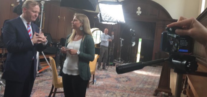
Having two people on a broadcast makes things feel a bit more natural, and allows for some pre-generated questions if your community is quiet. For all three broadcasts we have had two people “on camera”. For the Periscope broadcast we interviewed Professor Settle and one of her research students together. This was great as they were able to interact with both each other and the audience asking questions. Plus, it showcased the relationship between our students and professors and how well they can work together. For the interview with John Dickerson we had asked for questions beforehand but did not receive any. We brainstormed questions in the days before, sent them to him so he had some idea of what we’d be asking, and then used those as the base of the interview the day-of. We followed a similar protocol for the interview with Professor Clemens.

Periscope may have been first, but Facebook Live is much more user friendly

Having comments not disappear is very useful, especially when the person running the broadcast is not the one on camera. For our first broadcast with Professor Settle, I was frantically writing down questions on a notepad as they came in on Periscope while someone else was keeping an eye on Twitter for questions. When something came in I’d raise my hand to get their attention and then read the question out loud off camera. It made things a bit awkward and honestly more stressful as I was afraid I would miss someone’s question.

Always download the raw video

Both Periscope and Facebook Live give you the option to download the raw video to your phone. As much as I’d like to trust these companies to seamlessly save the video for posterity, having a backup is always great. Plus, in the case of Periscope up until a few weeks ago, saving the video to your device was the only permanent copy of the broadcast. This also allows you to put the videos up on YouTube or another video hosting platform to use for other projects.

You must have good WiFi

Securing a solid WiFi connection was the biggest obstacle for us when we did the interview with John Dickerson. The show was being filmed in the historic Wren Building’s Great Hall which had weaker WiFi than Facebook preferred. Facebook won’t even let you start the broadcast if it doesn’t think your connection is sufficient. To ensure we had a good connection I found an ethernet port in a nearby room and ran cable to my MacBook and used that as a private WiFi hotspot to use during the broadcast and it worked great.

Stay stable with a tripod (real or makeshift)

A shaky video can be really annoying for your viewers, so try to avoid holding your device by hand if possible. A tripod is ideal but a makeshift one using books or office supplies will work just as well. The first time we used a file holder that could be placed on a nearby desk that cradled the iPad Air we were using for the broadcast. For the second interview we used a standard tripod with an iPhone 6 held by hand on top (that was a bit more precarious than I’d prefer, but worked nonetheless). For our most recent broadcast we commandeered a small clock stand and a large stack of books to get to our desired height and angle.

You don’t have to use special media equipment (but it’s nice if you have it)

For our first broadcast we used an iPad Air, for the following two we used my iPhone 6. The reason we transitioned was camera quality, the iPhone camera is leagues better than the iPad one overall. We used no external microphones and overall I think the quality and sound were good (or at least, what would be expected for a livestream). Whatever device you’re using, having good, clear audio is key for your broadcast so make sure you check and test this before going live.

We’ve discussed purchasing some external equipment and there are over a dozen live video services out there that integrate with Facebook Live so some improvements may be made (multi-camera options would be amazing) but the simple iPhone works great.

Always test first

We have a dummy Facebook page that we use to test each video before we go live. Before every broadcast we have done a test broadcast. This allows us to know exactly what to expect when going live, check audio quality, lighting, and the WiFi connection.

Composure

As you’re setting up your video be aware of how to frame your shot. Facebook Live will crop your video square when showing it in the feed so make sure your subjects are always in that square frame even if you’re filming in landscape. Also when framing your shot, keep in mind how your video will appear in the user’s Facebook feed: no sound. So try to make the visuals interesting on their own without the audio if you can.

Give people time

It will take a minute or two for your audience to get the notification that you’re live (if you’re not on a scheduled time for your broadcast) and folks will need to get onto Facebook and find your page so give them a little time before diving in to whatever the main topic of your video is. Spend this time introducing your topic, who you’re interviewing, what’s happening on campus, etc. Also, around halfway through your video it doesn’t hurt to reiterate whatever you said in your introduction to catch those that may have come in later in the broadcast.

According to TechCrunch, Facebook will be launching a feature allowing you to pre-schedule broadcasts along with a “waiting room” for folks to wait in beforehand. They’re also going to allow two-person broadcasts (so folks from two different locations in the same stream) so that will be a nice new feature whenever it gets released.

Have you tried one of the live social video platforms? What lessons have you learned?


Cross-posted from William & Mary’s University Web & Design Blog.

More

William & Mary’s forays into live social video

Finding great ways to use live streaming social video on campus had been on the agenda of the social media folks at William & Mary since Periscope launched in the spring of 2015. However, no great projects or ideas really materialized, as the ephemeral nature of the Periscope videos made it feel like it was a lot of work for something that would disappear after 24 hours (granted, Snapchat has a similar issue but it is a very different platform, and possibly another blog post).

When Facebook Live entered onto the scene last year and then opened up live video to all people and pages this past April, that seemed like the true tipping point for live social video as the biggest social network was throwing their hat in the ring. This presented a really interesting new (and more permanent) way to communicate with our audiences on social media and I knew this was a tool we needed to be utilizing at W&M.

In University Communications we are always looking for ways to showcase our great faculty and students. Offering a way for our entire community to interact with interesting W&M people in real time (and ideally discuss some of their research) via live social video on platforms where our audiences already existed was a great melding of trying out an new technology and tying in to part of our general social media strategy.

W&M did our first live social video in late March, interviewing Government professor Jaime Settle about politics and social media. We had planned to use both Periscope and Facebook Live simultaneously (because why not just dive in head first and try all the things?), but at that point Facebook Live was still being a bit squirrely as to whether it was available to all pages or not. The day of the broadcast Facebook didn’t cooperate so we just used Periscope.

Our first Facebook Live post was right before graduation in May, when Face the Nation was on campus to interview our chancellor and W&M alumnus Robert M. Gates. John Dickerson, the host of Face the Nation, agreed to “Face the Tribe” in a short interview after they wrapped up filming of the show.

We completed our second Facebook live broadcast yesterday, talking to Government professor Clay Clemens about the the UK’s vote to leave the European Union.

I think this new way to interact with our audience and showcase great folks from W&M is definitely staying in the rotation. There have been a few lessons learned from these first forays into live social video and I’ll share those in my next post.

Cross-posted from William & Mary’s University Web & Design Blog

More

Hey good lookin’…introducing W&M’s new responsive design

Cross-posted from the W&M Creative Services Blog

Back in April we mentioned that we were working on a new responsive design for the main W&M website (www.wm.edu), and after a few browser fights (thanks Internet Explorer), a dozen test devices and many hours coding and tweaking, we launched our new design on July 23, 2013. (Grad school sites will follow suit in the coming months.) Now every office, every academic department and every other page on the W&M site adjusts its layout to best accommodate how you are viewing the site, regardless of what device you’re using (desktop, laptop, tablet or mobile).

The announcement

To announce the launch our office made a little stop-motion video (our first!) starring the computers, phones and tablets of various Creative Services staff members:

The motivation
desktop

Desktop/laptop view of the W&M website. The green bar on the left is the page navigation, center light tan area is the main content, and the darker tan boxes down the right side are the supplementary content.

The idea behind this change was spurred in large part by the fact that our mobile and tablet visits have gone from less than 2% of our site traffic in 2009 to over 17% of our traffic this summer. With so many mobile and tablet visitors (and more sure to come) we wanted to ensure everyone could easily navigate and view all of the content on our website, not just our homepage (which we made responsive last year).

Prioritizing

So what was involved in this redesign? Up first was evaluating which parts of any given page are the most important, and it is, unsurprisingly, the main content. That main content is why you search Google, click a link in a social media post, or work your way through navigation menus. This needs to be front and center (and top) regardless of how you are looking at the website. So, after our global site navigation and header, the most prominent thing you will see is always the main content. We then ordered the rest of the content: page navigation, supplementary content, etc.

The major changes
tablet

Tablet view. Here the right column has been moved below the main content area and the top “global” site navigation has been adjusted from one row to three.

As you begin decreasing the width of your browser window we adjust the global navigation to become three columns rather than one row (since the single row will no longer fit).

We then move the right column, which contains “widgets” with photos, Twitter feeds, related links and other supplementary content, down below the main content area.

So, with this first batch of changes nothing is removed, only rearranged to best showcase the content (this is a key feature of responsive design). Once the page width is even narrower, the menu on the left side of the page drops down below the main content as well (keeping its familiar green background for continuity). However, keeping in mind that page navigation is a useful and important part of the page, we provide a “Site Menu” link so you can quickly get to that area when you need to. In between all of these steps the content is stretched to fit the width of the page, and photos and tables are resized to be as visible as possible.

Those with a careful eye may also notice a few style tweaks, all made to enhance the user experience. We removed busy lines from the menus, adjusted the color and size of the content headings, and increased the font size and line height of the content. All of these updates were made to give the site a bit more space to “breathe” and to make things easier to read. We also ensured that our treatment of text links is consistent throughout the site, helping with the overall usability of the site—if a word is bright green (underlined or not) it is always a link.

Cheap as free “mobile version” for all, no app needed
mobile

Mobile view. A link to the site menu replaces the menu itself and the main content comes up front and center, with supplementary content following.

One of the best parts about a responsive design is that it is a seamless improvement for the folks creating the web content. Nothing changed in Cascade (our web content management system) from the web editor’s perspective. They still enter their page title, content, photos, links and so forth, just as they always have, except now the content they entered is mobile (and tablet and desktop) “friendly.”

What’s next

Currently our team is focusing on updating our four graduate school sites with their own responsive designs. Along the way we’ll also be making a variety of supporting sites responsive (those W&M sites not hosted in Cascade, like the directoryW&M Experts and W&M Events).

What do you think of our new design?

More

Responsive Design Resources

(Cross-posted from the W&M Creative Services blog)

As we’ve gone through the process of redesigning the W&M website to follow responsive paradigms we’ve amassed a list of resources we’ve found useful, ranging from general topic familiarity to issue-specific tools and tricks. Since there are many organizations out there starting to take a look (or are already knee-deep) in a responsive design, we thought these links may be of interest to others as well:

General
  • Responsive Web Design – Ethan Marcotte – The article that more-or-less started it all
  • Responsive Retrofitting – Since many folks don’t have the luxury of a full rewrite
  • Common Misconceptions About Touch – Steven Hoober – Since fingers and touchscreens are what have prompted us to even really need a responsive design in the first place, it’s best to know what you’re getting into
  • The State of Responsive – Stephanie Walter – A great summary of the current state of the art
  • Improving UX through Front-End Performance – Lara Swanson – Just making your site adjust to different sized screens doesn’t make it mobile friendly
  • Printing the Web – Hans Christian – Since  we’re trying to accommodate all kinds of devices, can’t forget paper (plus it helps you focus on your content, which is helpful in any size and medium)
Tools, tips and tricks
Retina images

Many of these links were discovered courtesy of two mailing lists: Responsive Design Weekly and CSS Weekly.

What other responsive design resources have you found that have been helpful?

More

How to tip the odds in your favor in search results – Headings, images & content (part 3 of 3)

(cross-posted from the W&M Creative Services Blog)

So you’ve set up the framework for your page, placing it in the appropriate spot on your site, giving it a readable URL and meaningful title, and filling in the description metatag. Next we will take a look at what goes into the main content area on your page.

Useful Headings

Headings help to create a hierarchy of information on your page. One way to think of headings is as if you were writing an outline of your page’s content like you did back in middle school for a research paper. If you skim the headings do you get the gist of what the page is about? W&M’s Web Writing & Style Guide encourages you to use headings thoughtfully and sparingly, which is also good practice for SEO. Use heading tags where it makes sense. If there are too many headings on a page your users will not know where to start visually; they will not be able to quickly determine what content is important, and they cannot easily scan to find what they were looking for on the page. Keep in mind, if your user cannot find what they’re looking for amongst a sea of headings, how will the search engine?

Images with “alt” text

Images may seem like just a nice visual element to add to your site but you can optimize them for search engines as well. All of your images should have “alt” text that is descriptive and can serve as a reasonable alternative (thus the “alt”) to the image if it cannot be displayed or is being “seen” by a screen reader for those users with vision impairments.

Another helpful SEO tip is to give your files meaningful names (just like your folder System Names). Rather than IMG0123.jpg, name it crim-dell-bridge.jpg (being sure not to use spaces, capitalization or any special characters aside from dash (-) and underscore ( _ ) ). Google looks at file names just as it looks at the URL and page name of your site, so giving it a meaningful name will help both the search engine and yourself find images.

Descriptive Links

Anchor text, the clickable text that users will see as a result of you adding a link to your content, should tell users (and Google) something about the page you are linking to. Avoid using “click here” or similar phrases. Instead describe where the link will take the user. This way it is easier for the user (and search engine) to scan the page and find relevant links as well as understand what the page you’re linking to is about.

Quality Content

Putting up clear, quality, relevant content on your website, whether in the form of an informative page title, well structured links, or useful image descriptions will help your page become more relevant to search engines. However, what influences your website more than any of these factors is the main content of your page. Creating compelling and useful content is what drives users to come to your page in the first place, and is what will prompt them to share that content and create the buzz that helps build the reputation and credibility of your site.

Content Questions to Ponder

If you are finding that your site does not appear where you expect it to when searching for a particular term, examine your content (this includes your page title, links and headings as well as the main content). Do you mention the search term you’re looking for anywhere in your content? Is it important enough that you should adjust your page title to include the term? You never want to “stuff” your page with search keywords to try and increase your rankings. However, if you find that people are searching for “agenda” when you are using the word “program” you may want to tweak your content to use that more common search term instead.

So with SEO it pretty much boils down to: write good content, name things clearly and concisely, and just generally be “friendly” to your users. These steps will take you a long way in making your site more relevant to Google and its searches, both on wm.edu and on Google’s main site. Happy searching.

More

How to tip the odds in your favor in search results – Titles, links & metatags (part 2 of 3)

(Cross-posted from the W&M Creative Services Blog)

We started with a quick overview of what Google says to concentrate on in your search rankings (do what’s best for your visitors) and how the W&M site search works. Now let’s move on to your actual web pages, starting with the things you create first when you make a new page.

Clear Site Hierarchy

Try to structure your website with the most important information “up front,” either linked from the homepage or very easily accessed from it. Using this kind of hierarchy in your site helps both users and search engines determine what is most important on your site.

Readable URLs

The system or file name is pretty much always the first thing you set when creating new content and it is what forms the URL for your page. For your system name try to be as descriptive as you can. Use dashes (-)  to separate words if you want a multi-word system name, for instance “meeting-minutes” rather than “meetingminutes.” Using a character like the dash or underscore to separate the words makes the URL easier for Google (and your users) to see what your page is about, a page like “www.wm.edu/folder1/folder2/index.php” is much harder to remember and figure out what the content is about than “www.wm.edu/about/history/index.php.” If there are key words in your page URL those will also be indexed in Google’s results, so this is one more spot where using meaningful names for your pages can help improve your search rankings.

Concise and Effective Page Titles

Each page in your site should have a short but unique title that clearly indicates to both Google, and the person viewing your site (either in search results or actually on the page) what the page is about and how it differs from other pages on your site.

Metatags (where needed)

Years ago the keywords metatag was a factor in search engine results but in recent years Google has begun ignoring the keywords field, mainly because sites were “stuffing” the keywords field to bump up their search results rather than putting in the most relevant keywords for their site. So this is not something you’ll need to worry about for your page.

A page’s description metatag gives Google and other search engines a summary of what the page is about. Although these do not directly influence the search results any longer, they are still important as search engines may use them as descriptive snippets for your page if it turns up in their results. Something to note, if the search engine finds text it deems more relevant to the user’s search, such as a sentence containing their search term, then that may be used as the summary for the search result instead of what’s in your description metatag.

As with page titles, the description for each page should be unique and specific to each page. If you copied the same description from page to page, how will users be able to distinguish which of your pages they want to visit when they come up in a search result? If all of the results from your site appear the same the user may skip your site altogether since it is unclear.

In the next post we’ll look at how the main content of your page affects your search rankings, with tips on how to improve those rankings using your images, headings and general content.

More

How to tip the odds in your favor in search results (part 1 of 3)

(Cross-posted from the W&M Creative Services Blog)

There is no magic bullet for getting your site ranked highly in Google’s (or any other search engine’s) search results. However, there are a handful of best practices that can help you make your pages more relevant to users and thus more likely to become top-ranked results in Google, this is referred to as SEO (Search Engine Optimization).

First, a starting thought from Google’s SEO Starter Guide (emphasis mine):

You should base your optimization decisions first and foremost on what’s best for the visitors of your site. They’re the main consumers of your content and are using search engines to find your work…Search engine optimization is about putting your site’s best foot forward when it comes to visibility in search engines, but your ultimate consumers are your users, not search engines.

Search results on wm.edu

On the W&M website we use a Google Custom Search Engine which, when you boil it down, is just Google’s normal search engine except it’s results are restricted to only look on a particular set of sites (in W&M’s case, anything ending in “wm.edu”). So all of the following tips from Google’s SEO Starter Guide will apply just as well to a site’s search results as to Google’s (although they may not match exactly).

In the next two posts we will work from the top down on a web page, from page URLs to image descriptions, exploring how each element affects search results — stay tuned…

More

Facebook Profiles vs Pages vs Groups

(Cross-posted on the W&M Creative Services Blog)

There are a lot of ways for people to connect on Facebook. What started as just a network for college students has mushroomed into a community of over 750 million active users where seemingly everyone (and nearly every business, celebrity, brand and university) has a presence. There are three main ways that an entity can have a presence on Facebook: profiles, pages and groups; not all of these options are suited for every occasion. Here are quick overviews of each type with answers to some of the most common questions about their differences.

Profiles

Facebook profile silhouetteProfiles are for people and only people. On your profile you can share photos, videos, web links, and general status updates with people you have connected with as “friends.” If you create a personal profile for any other entity aside from yourself Facebook will get grumpy at you as it violates their terms of service agreement. So this boils down to no fake names or personas (use a Page) and no creating multiple personal accounts (like one for work use and one for personal).

If you are concerned about mixing work and personal Facebook use, keep in mind that if you are an admin of a Facebook page it is not listed anywhere publicly, so no one will know to contact you or associate you with that professional page. You can utilize friend lists to keep work and personal Facebook friends separate and control what each group sees by selectively sharing information via your Facebook privacy settings.
For more on friend lists and privacy see the Facebook Help Center.

If you have created a Profile rather than a Page, for your business or brand, Facebook now offers a way to convert your Profile to a Page. Be warned however, only your photos and friends (who will be converted to “fans”) will be moved over, your wall posts and any other data on your profile will not be saved so make sure if you want to keep that information you have it backed up somewhere. For more details on how to convert a profile to a page, check out the Facebook Help Center.

Pages

Facebook page iconPages are essentially profiles for any entity that isn’t a real-life person on Facebook. Pages have the same photo albums, wall and info page as a personal profile, but you can have an unlimited number of “fans” rather than “friends” (which is limited to 5,000). Many celebrities also maintain a fan page in addition to, or in place of, their personal profile. This avoids the friend limits of a profile and when the celebrity is also a “brand,” is a way to keep their business and personal entities separate.

Facebook allows there to be one or more administrators for a Page. A cool feature released by Facebook allows an administrator of a Page to post wall messages or comments while masquerading as the page itself, rather than as their individual account. This feature is another good way to keep the business and personal aspects of Facebook separate if you manage a Facebook page for work.

For detailed info on how to create and manage Facebook Pages, visit the Facebook Help Center.

Groups

Facebook group iconIf you have a need to more frequently or directly communicate with a small community of people then a Facebook group is the way to go. You can utilize Facebook’s group chat, shared documents, and messaging features (where members will get emails rather that status updates in their Facebook stream as with a Page), to communicate directly with the members of your group.

There are three kinds of Facebook Groups:

  • Secret – Only members can see the group and what members post
  • Closed – Everyone can see the group. Only members see posts
  • Open (public) – Everyone can see the group and what members posts

If you are debating between a Group and a Page, consider how you plan on using it. Do you want to have a real-life “club” feel with a directly engaged community? If so, use a Group. If you want to offer interesting information to a large audience and publicize your organization, use a Page.

For more on Facebook groups, visit Facebook’s official Group help page.

Speaking of Facebook Groups, if you’re in charge of (or have any interest in) social media and are part of the W&M community, please join our W&M SMUG (Social Media Users Group) Facebook Group.

More